Orby AI Dashboard
#UX Research
#UX #UI
#UX #UI
an AI-Powered "auto-complete" platform designed to enhance the daily workflow for Google, especially for Google Business Process Outsourcing team, empowering them to automate mundane and repetitive tasks effortlessly
My Role
UX ResearcherUX Designer
Contribution
User ResearchUX Design
Prototype
Visual Design
Team
1 Project Manager1 Design Lead
3 UX Designers
Client
Orby AITools
Figma
Figjam
Adobe Illustrator
OVERVIEW ︎︎︎
📃
Context
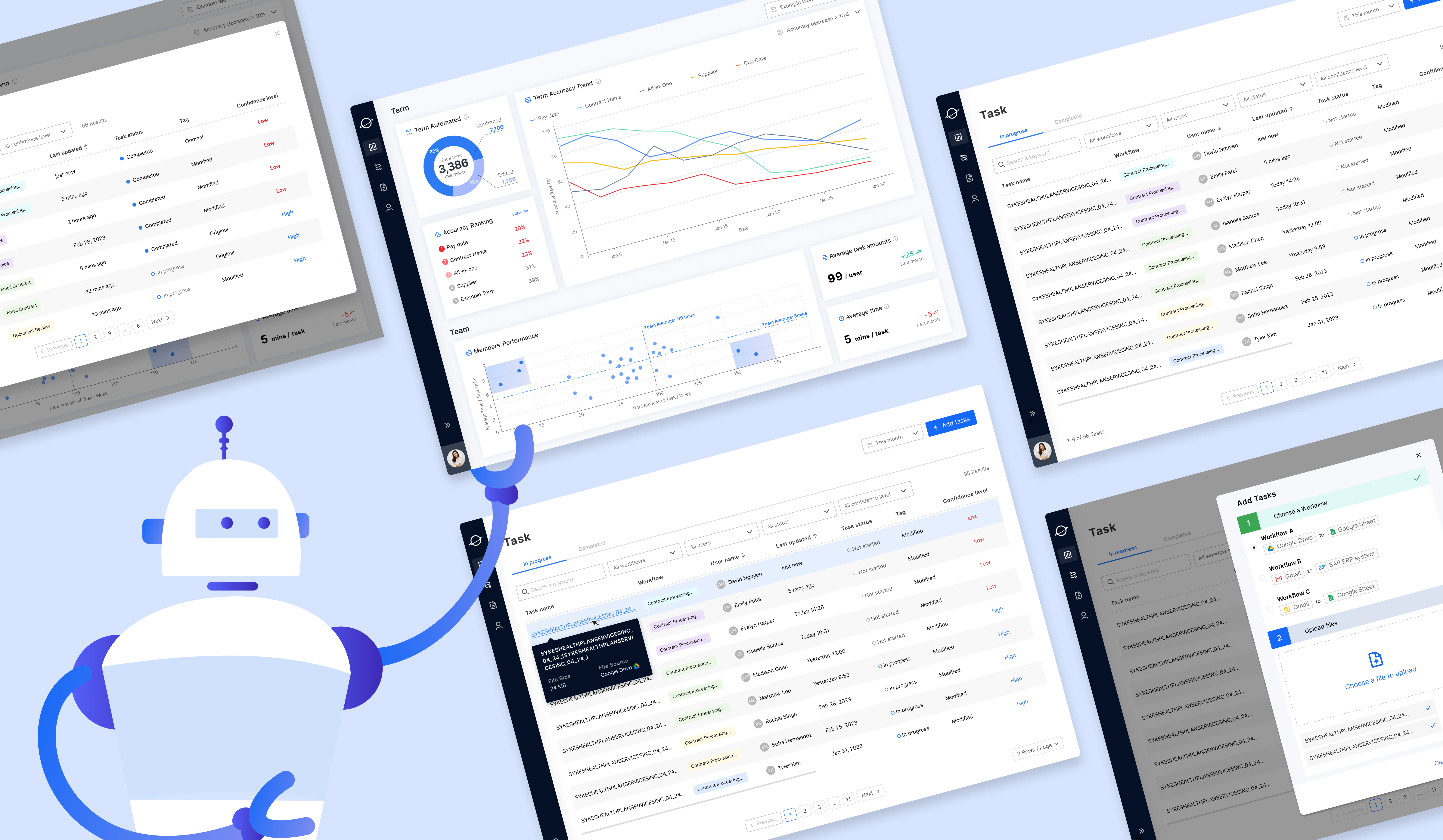
Orby AI, is working on an web-based AI-powered contract processing automation product that aims to improve document handling productivity for enterprise users.
The core mission is to enable no code + user friendly experience for non-tech background users.
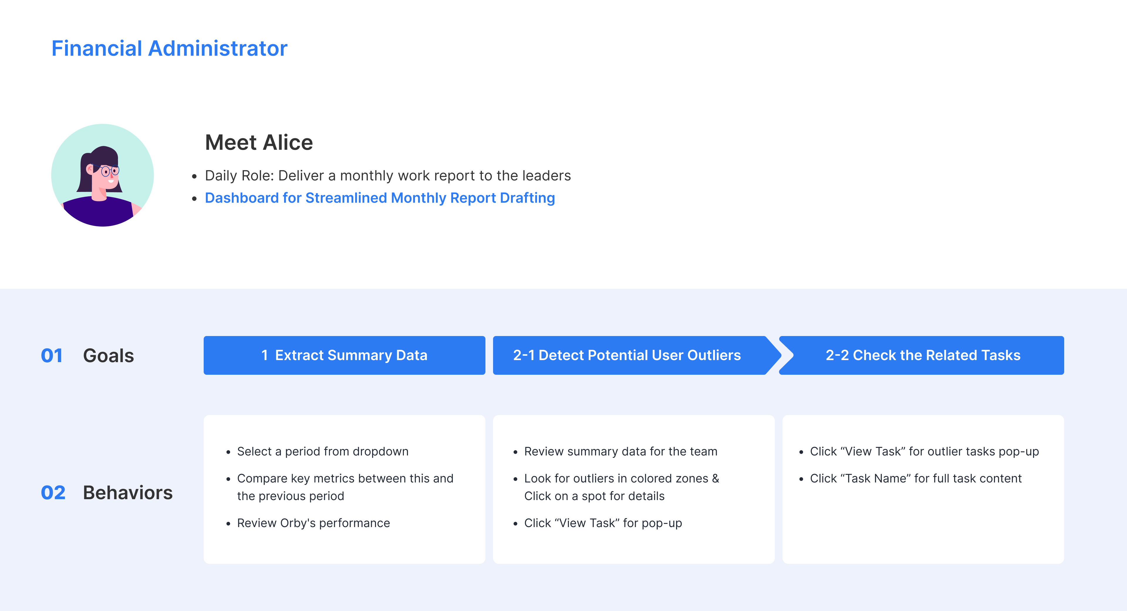
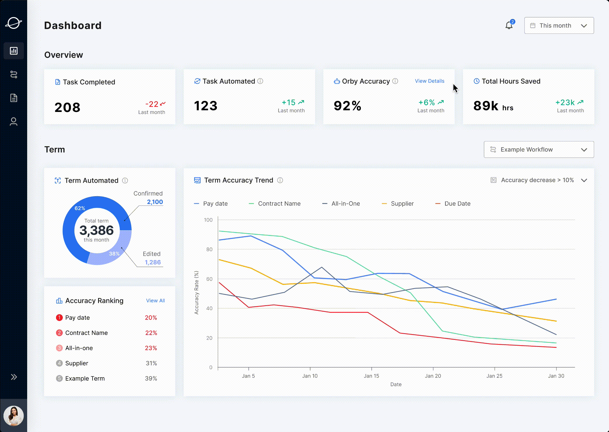
In order to increase users’ trust for Orby and have more transparency in data, we designed the dashboard main screens for two primary users (financial administrators and a nalysts ) to have a sense of the improved productivity, the time they have saved, and monitor accuracy.
The core mission is to enable no code + user friendly experience for non-tech background users.
In order to increase users’ trust for Orby and have more transparency in data, we designed the dashboard main screens for two primary users (financial administrators and a nalysts ) to have a sense of the improved productivity, the time they have saved, and monitor accuracy.
🧐
Problem Statement
How might we design a dashboard to help for task management and trouble shooting?
🗝️
Final Solution
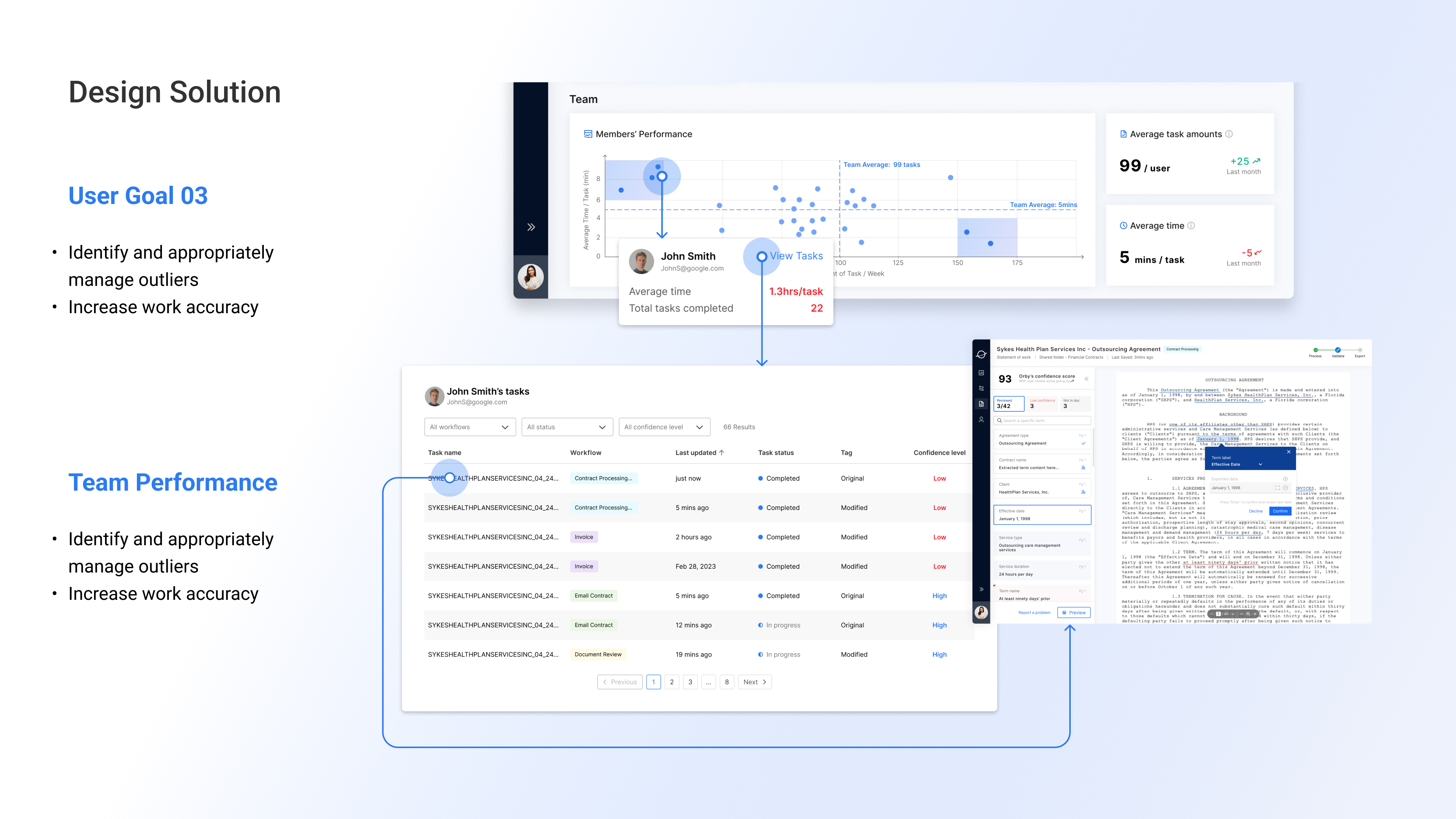
🏃 How it Works
➡️ Financial Admin’s Daily Work
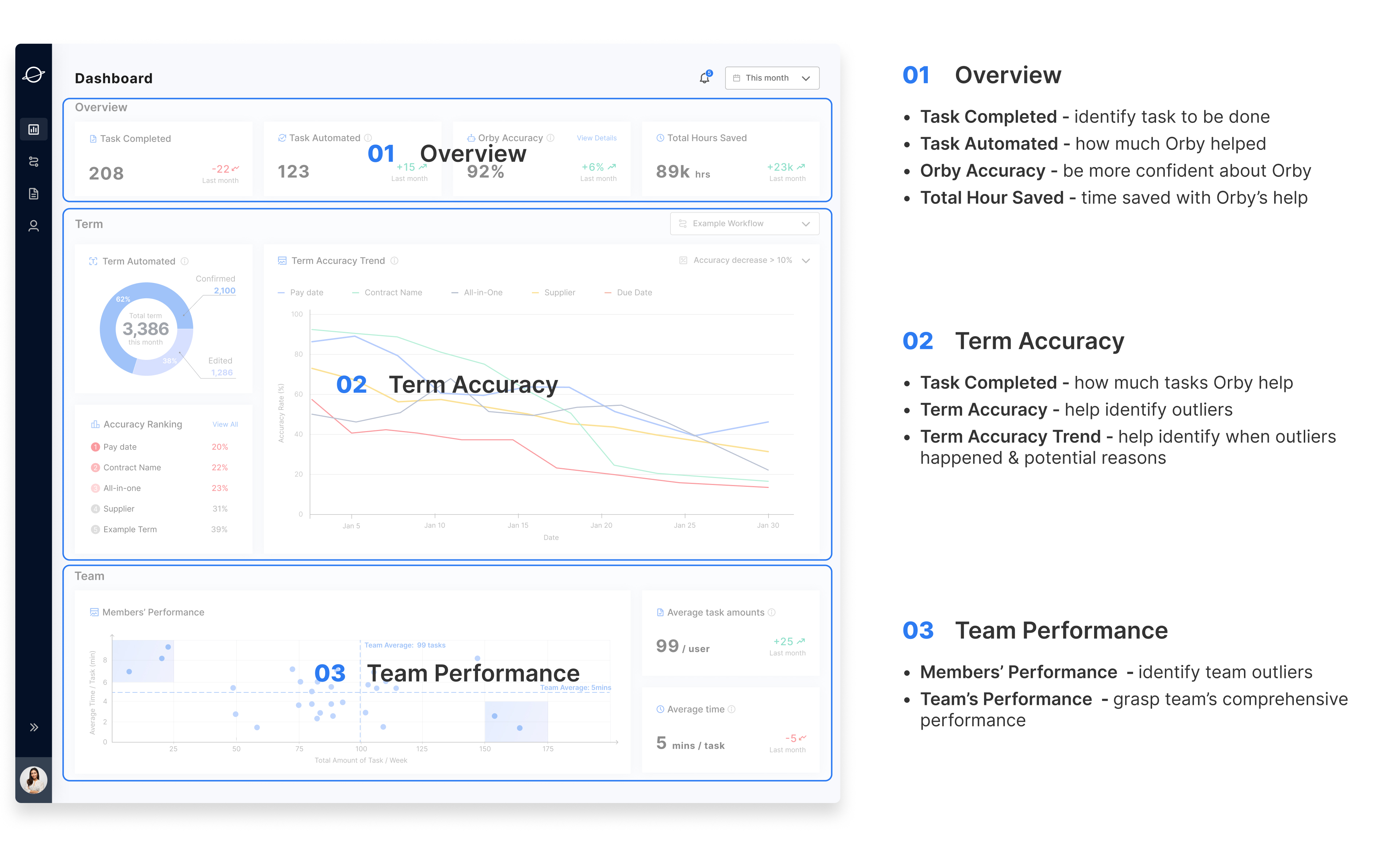
- Review the “Overview” section
- Produce work summary
- Check team performance to manage team
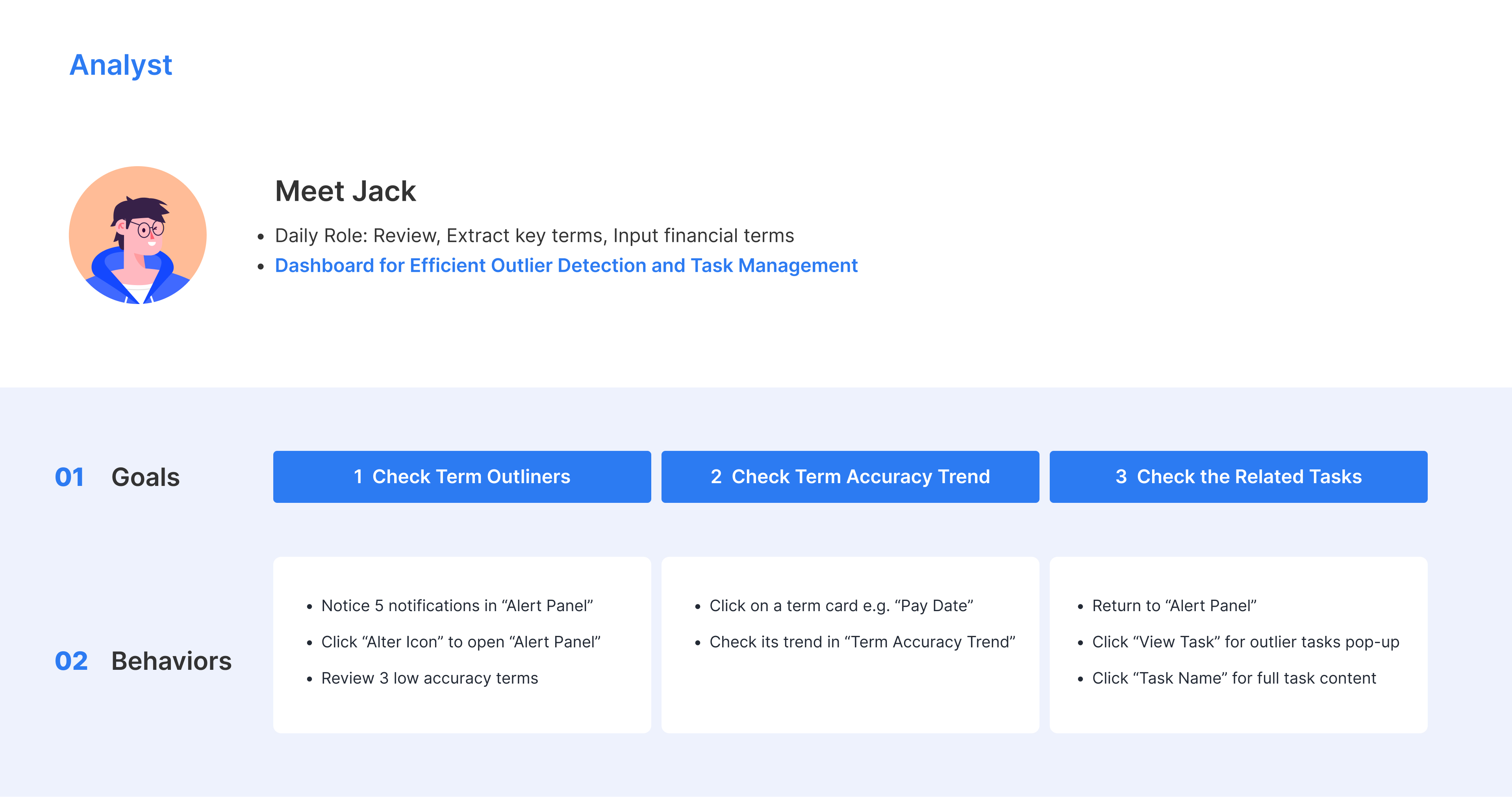
➡️ Analyst’s Daily Work
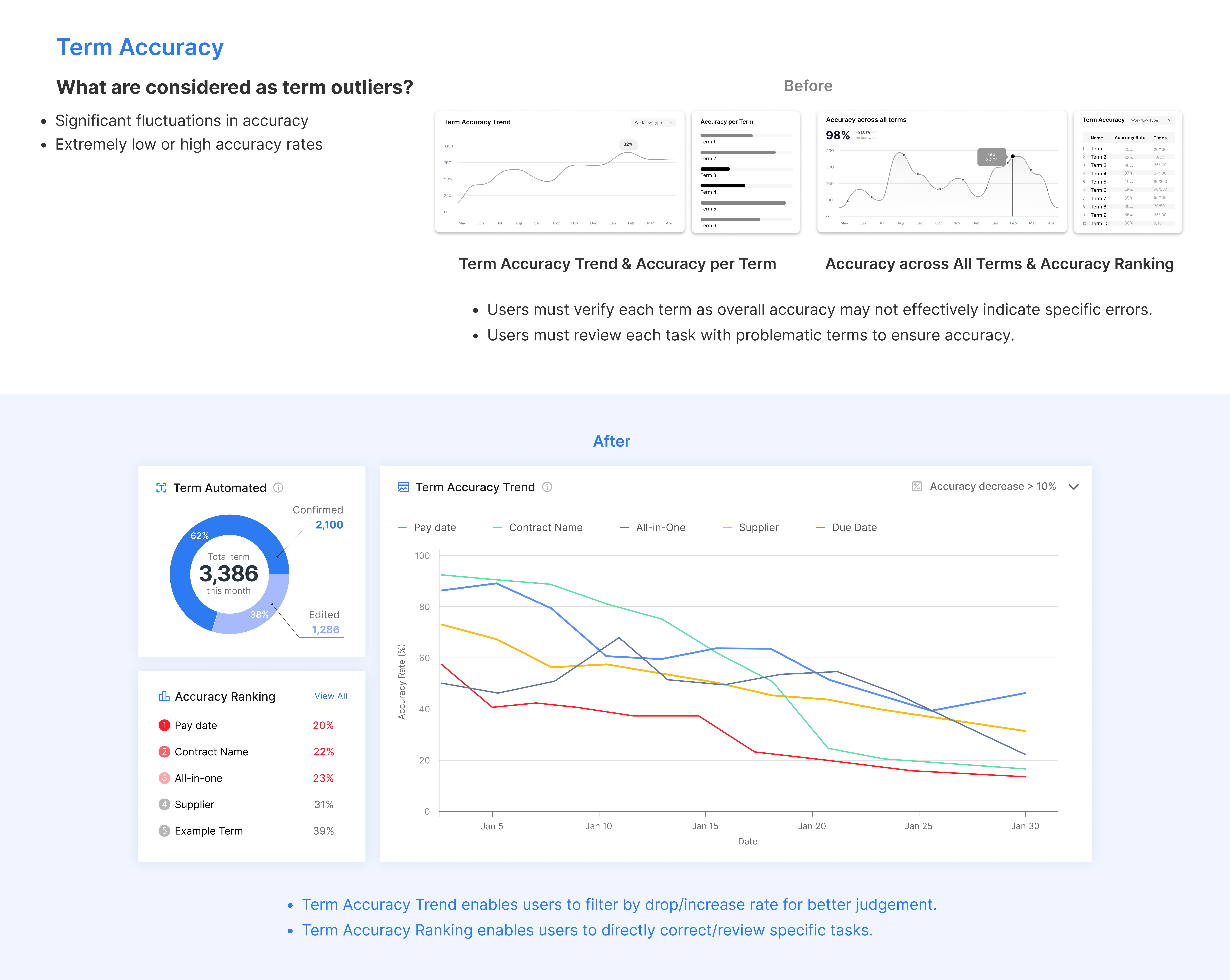
- check alters to know Orby's term accuracy
- potentially identify term outliers
- drill down to related tasks
- gain valuable insights
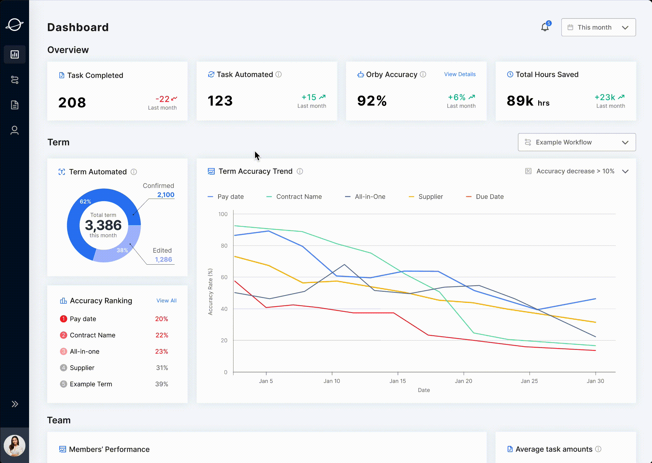
🚀Impact


Align with Orby’s Mission
Non-Tech Friendly
Efficiency Boost
Data Visualization
Deliver a no-coding product experience
Empower users to enhance daily work efficiency
Facilitate visualizing key metrics for accuracy and troubleshooting
RESEARCH︎︎︎
💬 Interview
What do we want to investigate through stakeholder interviews?
Goal 01
Goal 02
Goal 03
Get familiar with the scenarios of work routine + user goals by different users
Know what data to monitor for trouble shooting under work routine
Define the design scope and understand the considerations from our client
💡 What We’ve Learned
🔍 Competitive Analysis
Through learning from the best practices in the adjacent fields, we gained 3 main insights for dashboard design.
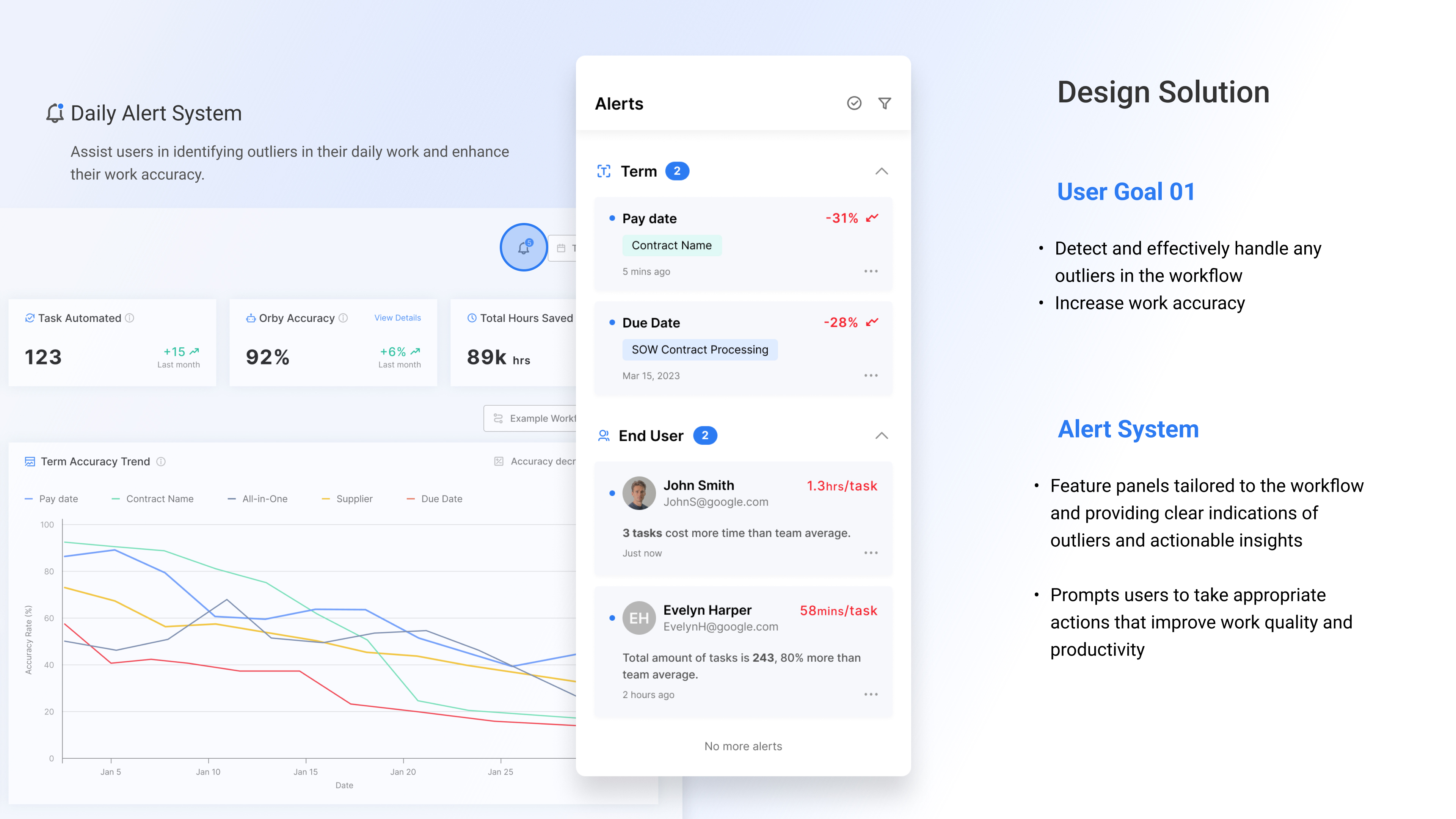
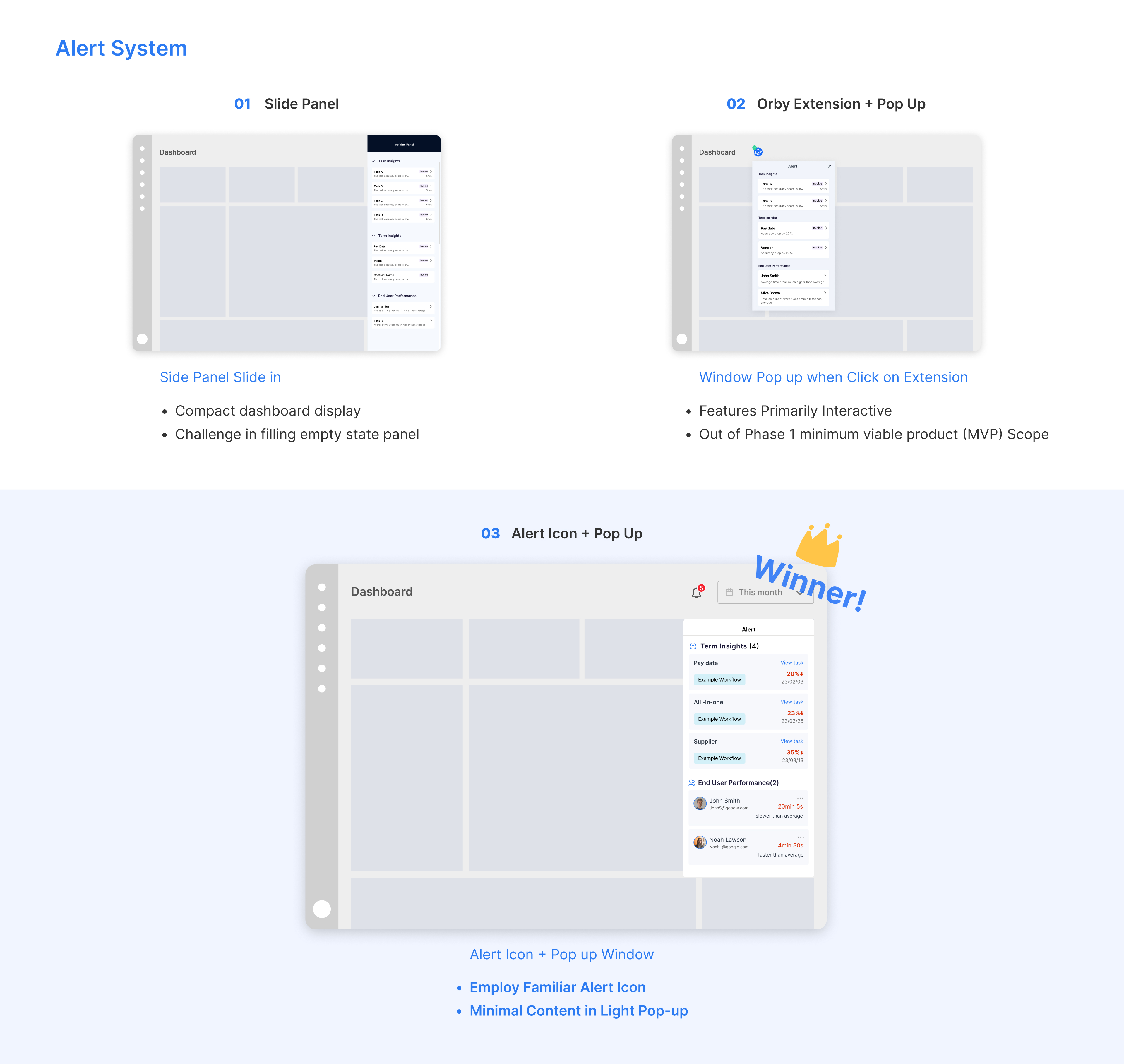
01 Alert System
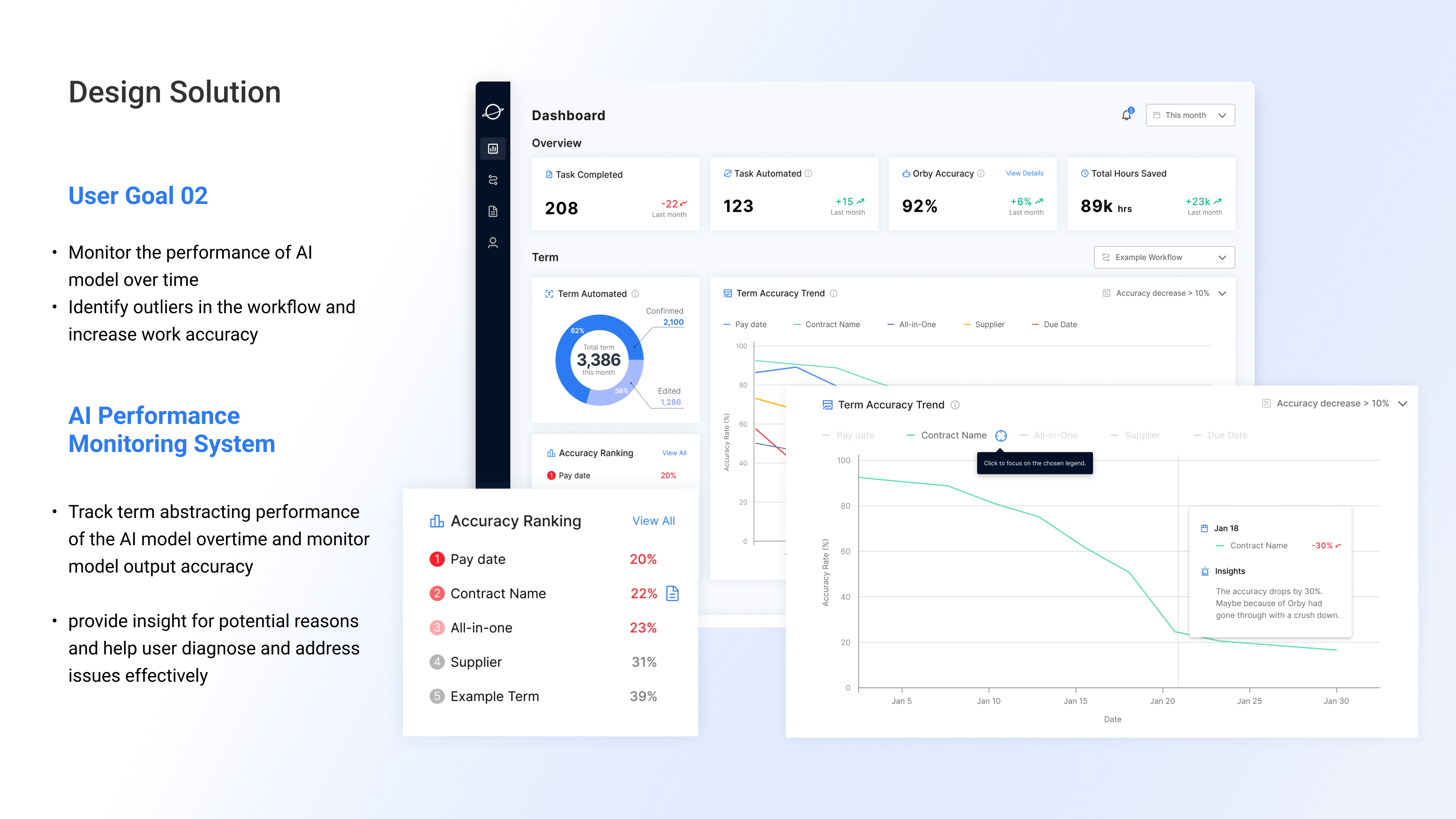
02 Key Metrics Summary
03 Data Visulization
Good dashboard design = explanatory + exploratory.
Providing alerts enables users to make better judgement in daily work.
Providing alerts enables users to make better judgement in daily work.
Providing summary of metrics helps user quickly know what to monitor at a glanc and avoids losing time by getting lost in huge amount of data.
The overall layout needs to be simple and efficient.
The reasonable data visualization provides an easy path for users to acquire information and interact with data.
The reasonable data visualization provides an easy path for users to acquire information and interact with data.
❓ Problem Reframe
How might we design a dashboard to better display key metrics and help target users to quickly find outliers?
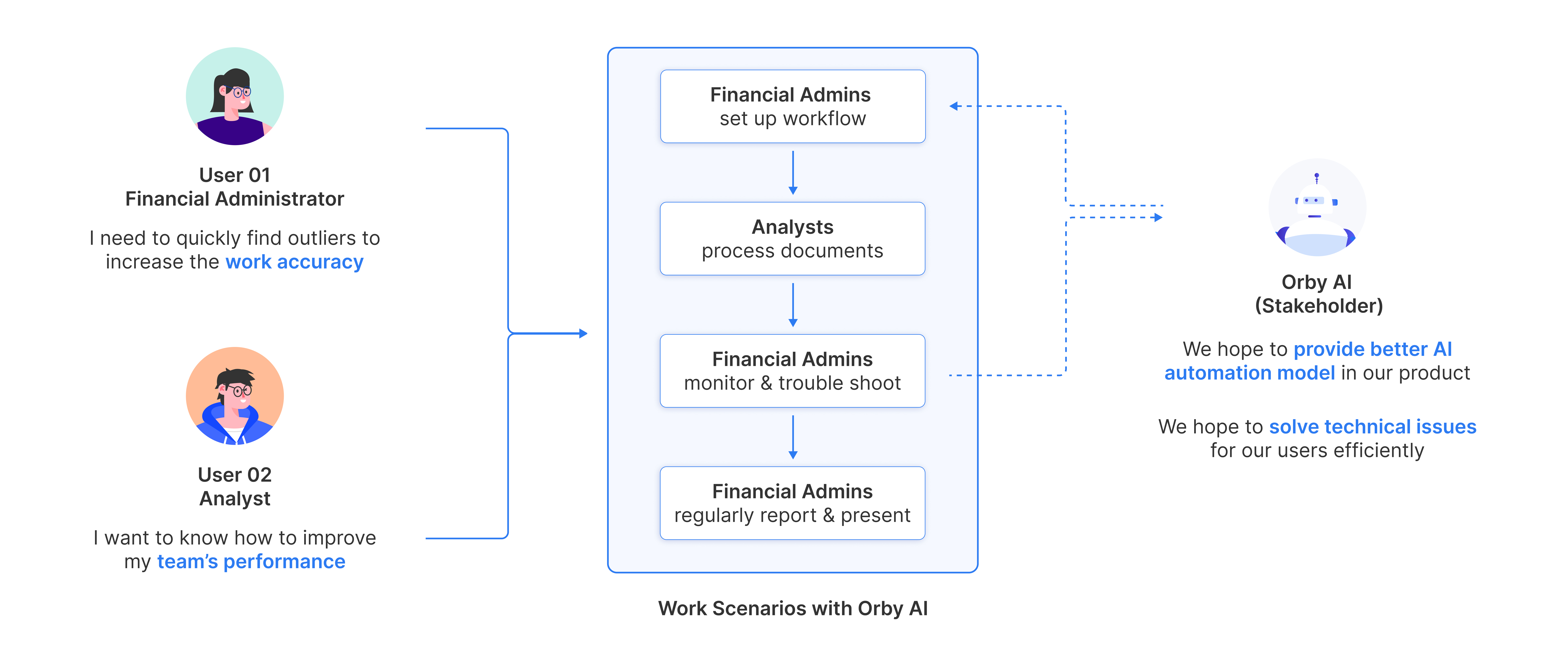
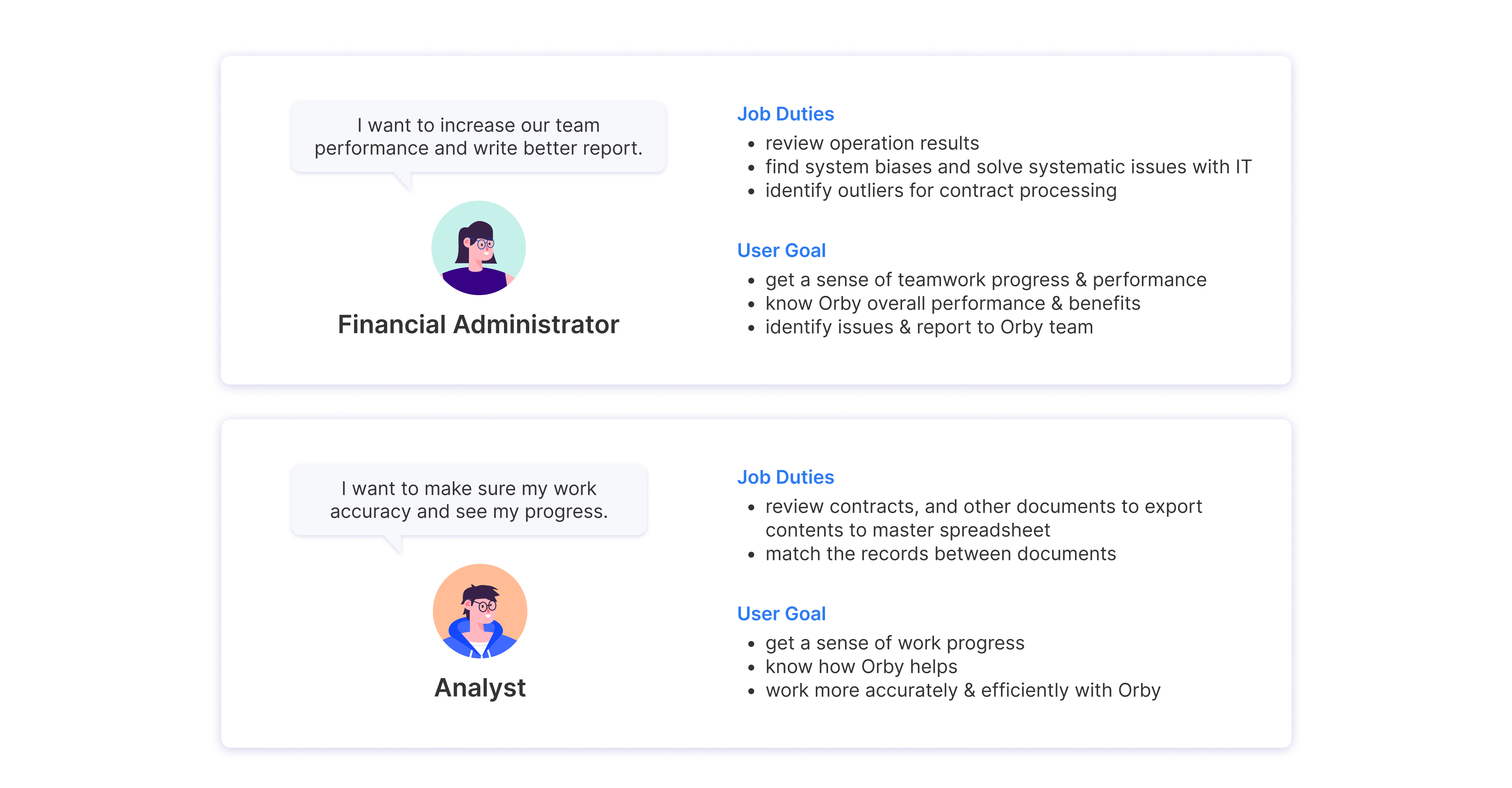
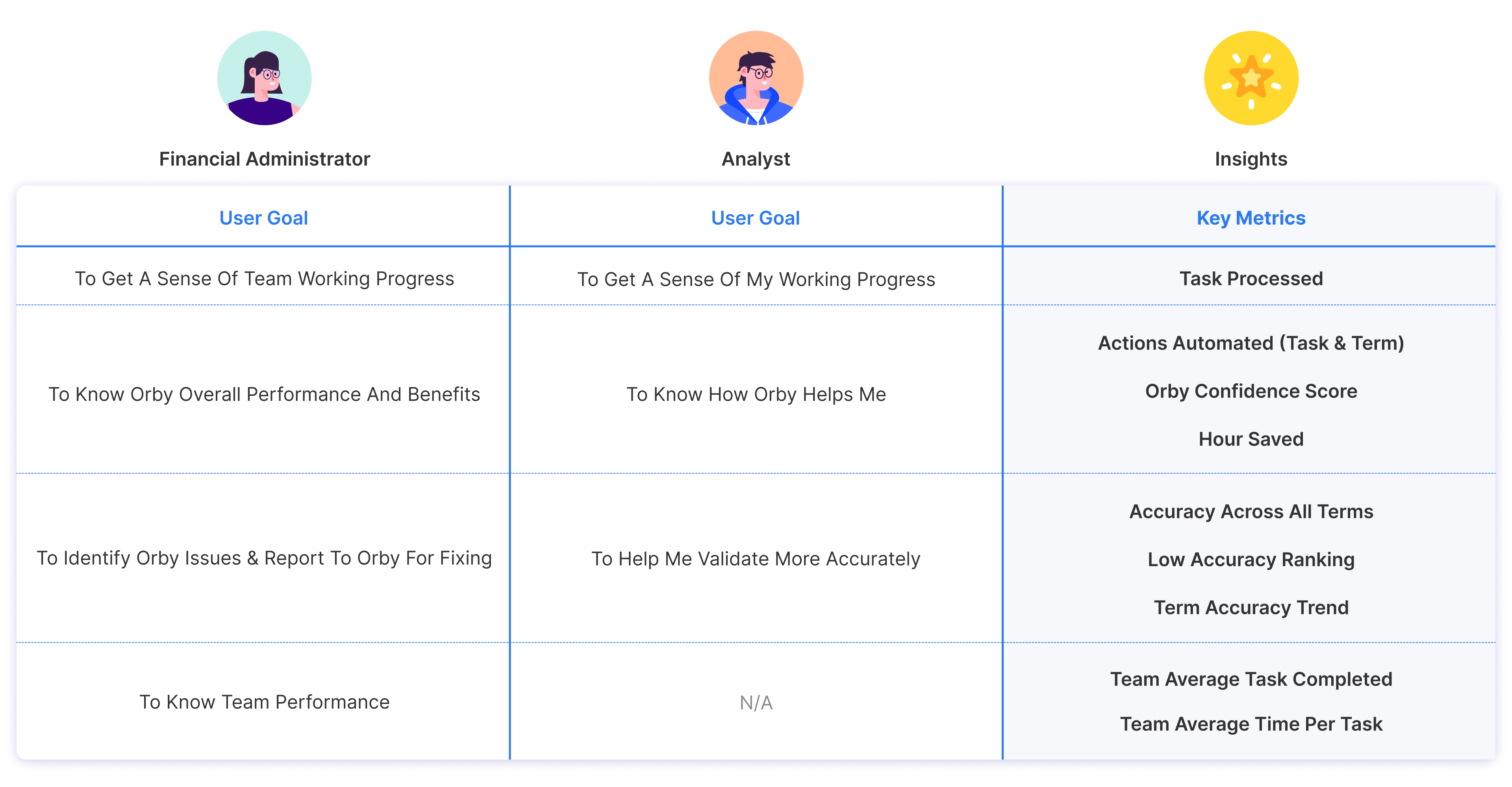
🤝 Personas
2 major personas look at data differently,
which enable them to make better decisions in work routine.
📍 User Story
IDEATION & ITERATION︎︎︎
🗃️ Organize in Best Way
To decide on the best organization,
we explored different versions of wireframes with Information architecture with 2 principles in mind
we explored different versions of wireframes with Information architecture with 2 principles in mind
01
Keep information hierarchy and navigation simple
02 Stick to the rule of modularity and scalability
🧱 Build Overall Structure
More efficient design through simplified Information Architecture
In 1st round of iteration, we cancelled the initial idea of navigation tab design to:
- limit redirections in user experience
- reduce the difficulties in development process
- simplify information architecture
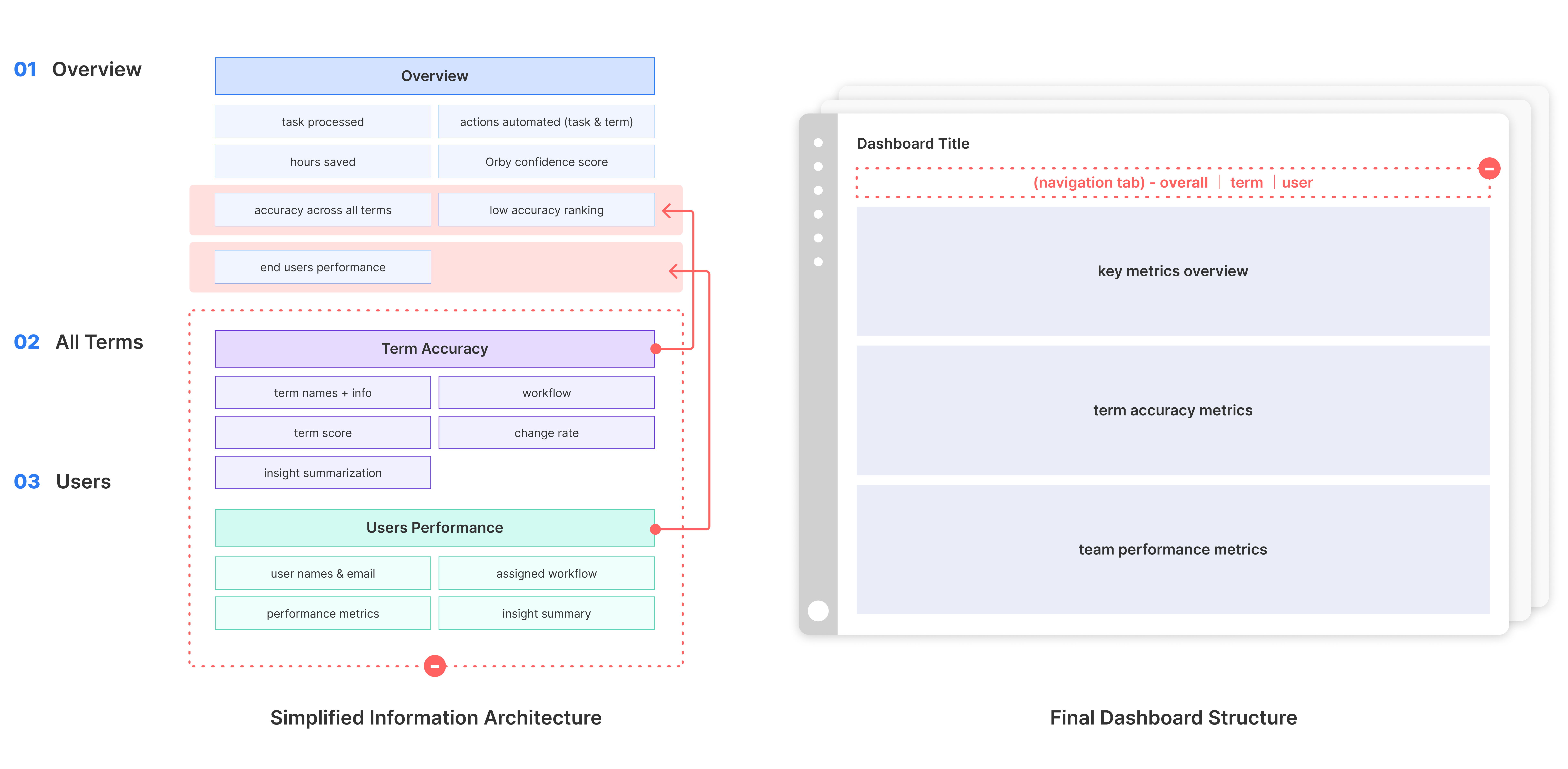
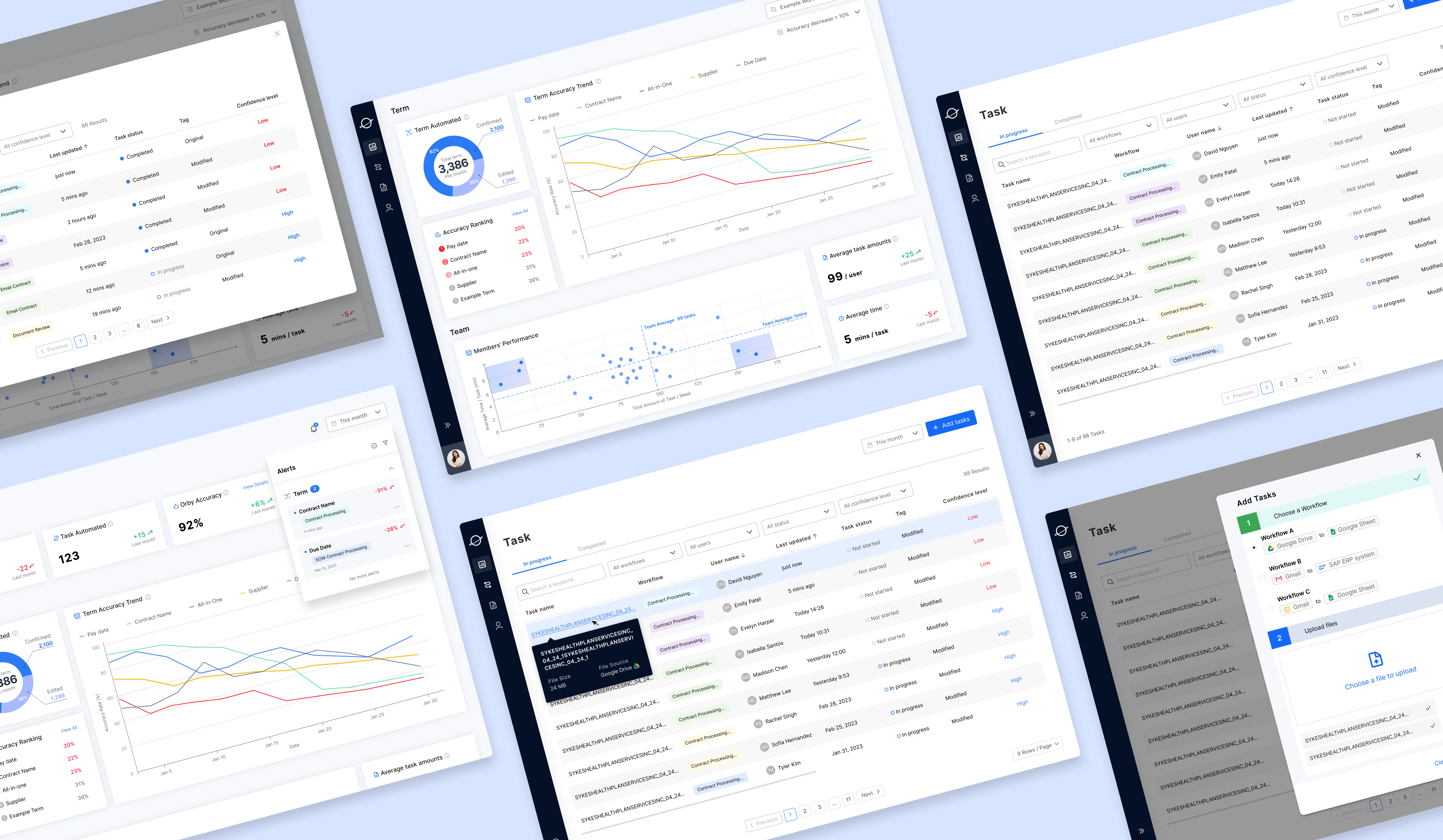
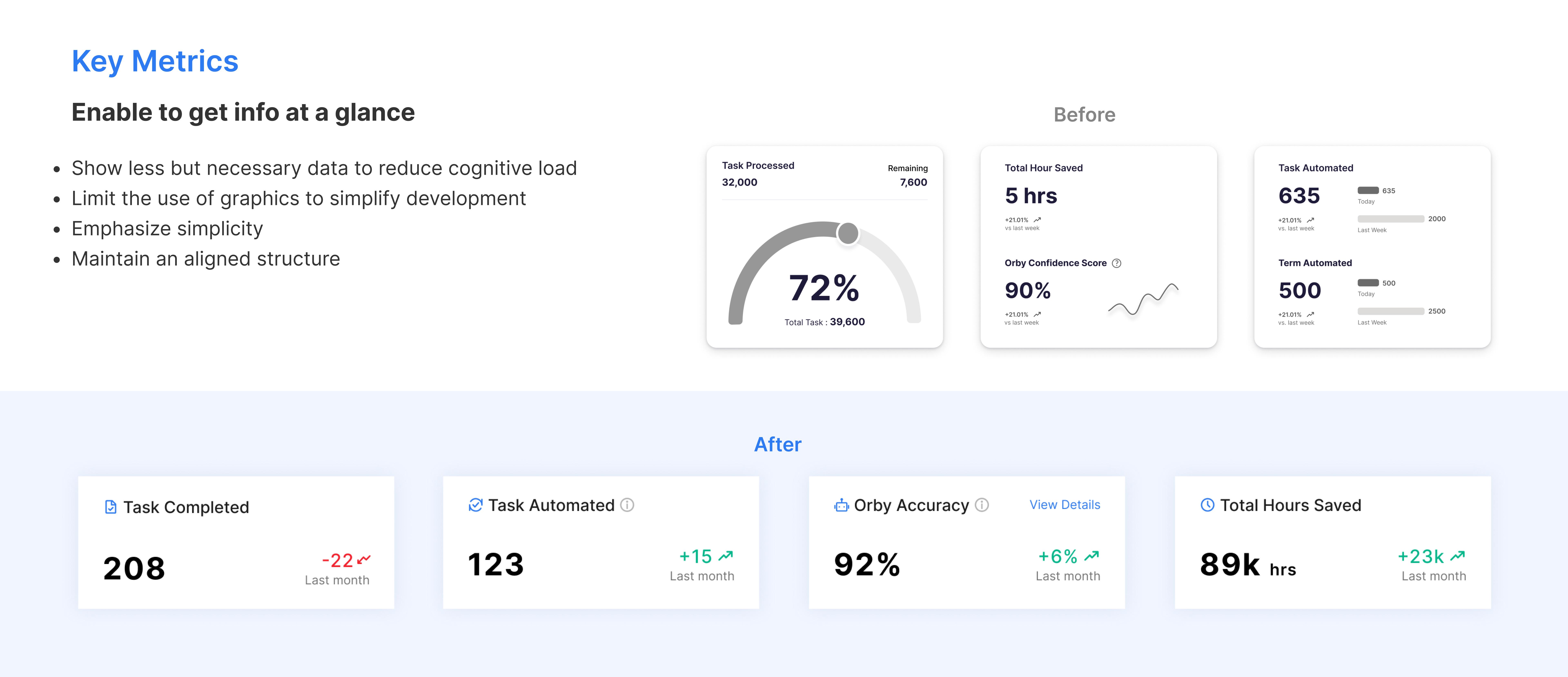
📊 Organize Charts

🗃️ Visualize Metrics

REFLECTIONS︎︎︎
Stakeholders & Users
Domain Knowledge
- The project focused on clients buying and users using the product.
- Different user needs were considered due to varied work routines and goals.
- The project involved B2B, B2C, SaaS contexts.
- Understanding user routines and goals was vital.
Design Scope
Iteration Planning
- Project goals were set from the start for clear expectations.
- Helped clients/users define their goals, often uncertain initially.
- Both converging and diverging approaches were balanced.
- Scalability was prioritized for future additions.
- Balancing essential and nice-to-have features was key.
- An MVP-focused approach guided iterative development.
Prioritization
Development Cost
- Distinguished between must-have and enhancements.
- MVP was given high priority for core functionality.
- User goals and routines guided information display.
- Leveraged open source tools to save time and labor.
- Careful consideration of technical, time, and budget constraints.
- Balance between technical feasibility and resources was maintained.
NEXT STEPS︎︎︎


Customization
Responsiveness
Admin Access
Enhanced Drill Down
- Tailor metric categories and space
- Adjust columns and task filters
- Optimize layouts across devices/windows
- Ensure smooth cross-platform experience
- Provide admin access to user dashboards
- Enable efficient user monitoring
- Expand drill-down options, including hover drill-down
- Deepen data insights effortlessly

If you're all the way down here already,
thank you so much for taking the time out of your day to live this journey with me!
thank you so much for taking the time out of your day to live this journey with me!